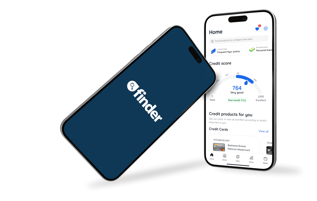
Finder is an Australian-based comparison site helping people make better financial decisions every day. With over 2 million monthly visitors across Australia, the US, the UK and Canada, Finder enables users to compare hundreds of financial products such as bank accounts, investments, and retirement funds.
The Challenge
Finder wanted to refresh the App Store screenshots to increase the conversion rate and lower UA costs. Using best practices, our learning from the hundreds of tests we have run so far, company strategy, and brand guidelines, we prepared a screenshot testing roadmap that included a complete makeover of the current screens as well as elements we want to A/B test in the screenshots as iterative testing, where we change only one element at a time.
Hypothesis for one of the many iterative tests:
We hypothesized that a different design for the cover screen, with a stronger illustration and more prominently displayed media coverage, would lead to a higher conversion rate.
The Solution
To test our hypothesis, we focused on three key aspects of the cover screens: illustration, font of the copy and social proof.
We aimed to emphasize the power of headlines on the first screen by increasing the font of the headlines.
Additionally, we replaced the existing illustration with a new one that is more encouraging and aligned with the app’s value proposition.
We wanted our social proof to stand out more, so we tweaked how they looked by adding a shadow to the background to increase their contrast with the background color.


