A Guide to the best App Screenshot Generator Tools for 2022
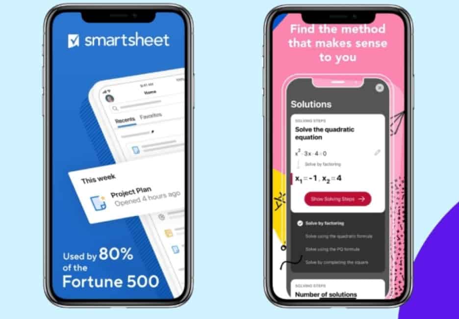
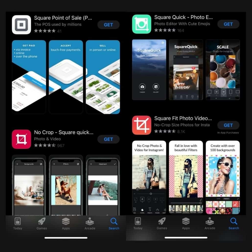
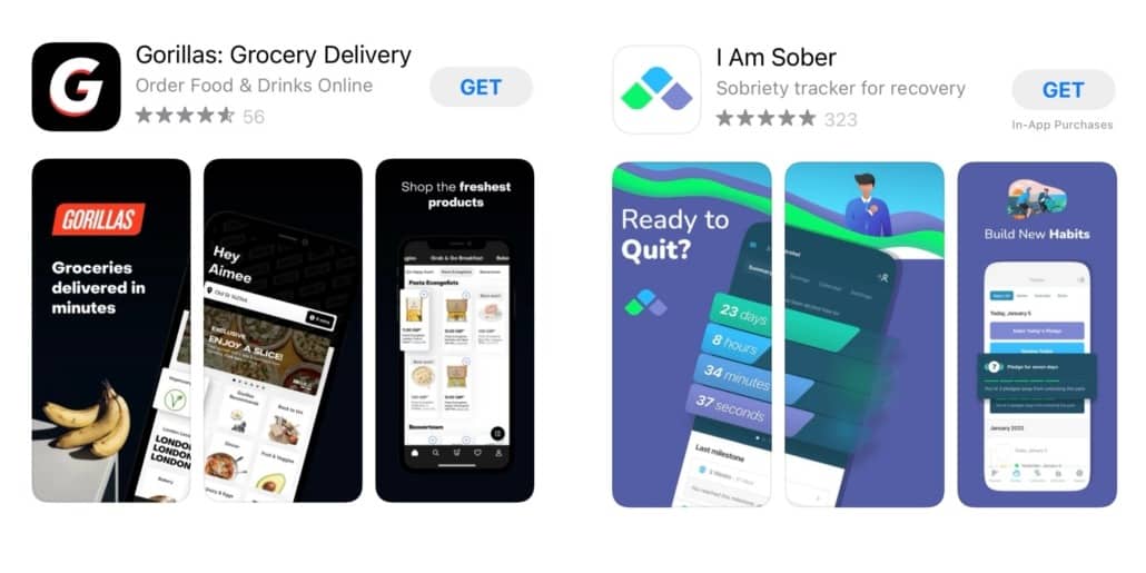
Screenshots are arguably the most impactful promotional tools in the app developer’s promotional armory. They tell a memorable story sometimes at a glance. If your goal is to multiply app downloads, screenshots and app icons are a good way to do it. Indeed, it’s a driving force in connecting app functions and features to mobile user expectations. Ignoring screenshot power will likely turn out to be a severe strategic error.
Why are the app screenshots so important?
Because your App Store Optimization depends on it. Natural searches massively influence the process of discovering apps on Google and other search engines – we all know that. However, even if your app appears prominently, people tend to go straight to the screenshots for a first impression. Consequently, optimized screenshots that jump off the page are crucial to your ultimate success.
It’s also notable that lengthy app descriptions don’t play into most customers’ behavior patterns. On the contrary, your audience generally relies on impulse and emotions to guide their decisions. What about “read more” buttons positioned at the end of a teaser? Did you know that only 2% of users follow that carefully laid route? It boils down to the fact that appealing screenshots generally are the key deciders, determining whether prospects progress or abandon the customer journey.
In a real-life situation, the company Fifty-Three used a SplitMetrics A/B testing platform to evaluate screenshots with Chinese localization in mind. The net result was that they achieved close to a 33% jump in downloads by relying on the test metrics and making adjustments accordingly. It provides insight that there’s no substitute for reviewing, redesigning, and optimizing your app’s screenshots to meet segment requirements.
The best app screenshot tools for 2022
A methodically executed app store screenshot design lies at the root of every successful ASO strategy. Here are some of the tactics and tools that work best:
1. AppScreens
This tool will assist you in designing superlative screenshots for Android and iOS – compatible with all Apple and Android devices. Moreover, a single design can network out to all of the latter from one source. It signifies that the company measures up to high-quality standards of flexibility and agility in competitive situations where it’s needed most.
The tool offers:
- Text auto-resizing.
- Seamless execution of app localization.
- Numerous layout options (including landscape)
- Attractive, vivid backgrounds.
- An easy transition to customizing your designs via multiple templates
- A way to export to all relevant devices simultaneously.
- Translation capability to reproduce your screenshots in 35 languages – making app localization a cinch.
Appscreens falls short on test-driving it by offering a free plan for only one product with limited access to their professional features.
2. Appure
Appure is a powerful tool you want to consider for dedicated localized screenshot options. It promotes features like multi-project management, at speeds beyond your expectation. Its most compelling features cover:
- Localizing your app in 28 languages, aligning closely with the Apple App Store and Google Play.
- Designing customized screenshots with numerous features that embrace:
- Background
- Images
- Frames
- Shadows
- Positions
- Rotations
- Fonts
- The ability to create random layouts and new designs click by click.
- Working on up to 10 different apps simultaneously.
Limitations: The time-wasting part of deploying this application arises from the absence of a template library. Also, it takes some getting accustomed to the user interface, but once over that hurdle, it’s plain sailing.
3. Previewed
Previewed is the tool you want in your corner for mockups, 3D device renderings, and animations. Panorama screenshots across the full range of iOS and Android devices are yours after only a few clicks. A compelling feature is its app store preview video to attach all the bells and whistles before publishing and promoting through the app stores.
Other features include:
- Effortless style and color customization
- Agile and far-reaching export capabilities
- Cloud storage and backup of templates and mockups
- A Drag ‘n Drop editor that’s intuitive and user-friendly.
Limitations: Localization isn’t available, and no free try-outs for undecided prospects.
4. AppLaunchpad
AppLaunchpad is another application designed to create screenshots compatible with all Android and Apple devices. It offers:
- Extensive layout options
- Numerous pre-designed screenshot templates
- A free plan that provides three standard templates and limited access to device frames
- Paid pro plans that open things up considerably (versus free), giving access to 14 diverse screenshot templates and all the additional features that facilitate customization.
- A device frame range that can optimize the app’s screenshots with unique formats and platforms in mind.
- An excellent, user-friendly interface that connects the user quickly to vital features. Also, it promotes customization, such as:
- Backgrounds
- Templates
- Fonts
- Colors.
Limitations: AppLaunchpad doesn’t allow one project to cover iOS and Android. If you want both, it involves a second project. Additionally, no access to panoramic backgrounds and only five languages in the repertoire severely hamper localization.
5. App Screenshot Maker by AppInstitute
AppInstitute is a free app screenshot generator for developers aiming to create iOS and Android screenshots. However, as you would expect, there are limitations in both the layout and customization arenas. Moreover, it fails to embrace iPad and iPhone X devices. Now that we have the bad news out of the way, here’s what you can expect from this option:
- Eight basic templates
- A choice of four device frames.
- A “cloning feature” allows you to quickly copy design sets and export them to other apps with more flexibility and support range.
- Zero fine-tuning features; notwithstanding, seamless customization that takes in:
- Background
- Fonts
- Colors
6. Snapshot by Fastlane
Snapshot by Fastlane deserves priority consideration if your objectives revolve around screenshot processing. Talking specifically, we mean taking screenshots with less hassle and faster. The compelling features of this app converge on:
- Automatic screenshots
- Creating numerous versions for consideration.
- Saving you hours of work by:
- Smoothly resolving systematic process issues like blurry texts, wrong frame size, and scaling.
- Translating your collection of screenshots into multiple languages for all devices, feature by feature – thus, making it ideal for seamless localization.
Limitations: Snapshot is tech-centric, requiring users to possess coding skills and technical knowledge for maximum app leverage.
7. App Store screenshot
App Store Screenshot is another free app screenshot generator with compelling features alongside notable limitations. The latter is the app confines you to one design for all screenshots. Moreover, forget about Android tablet layout support and any localization features – it can’t cover those. That said, the advantages are:
- One can create a unique app store screenshot design and more.
- Its modern interface accommodates the ability to design screenshots for almost all Android and Apple devices.
- Perfect for developers wanting to create free, quick screenshots and still access a significant degree of customization.
- It’s one of the fastest and most straightforward to use, and that’s substantial value considering it’s free.
8. PlaceIt
PlaceIt, although not strictly not a screenshot tool, it’s a fantastic mockup site. Look at what they offer:
- A massive template library is categorized down so you can extract those best for iPhone devices (as an example – over 60 layouts).
- A drag-and-drop feature intuitively lets you place any screenshot in a selected mockup design.
- Reproducing iPhone and Android screenshots that reflect various angles and styles and applying a combination of customized backgrounds, fonts, and colors if desired.
Limitations:
- It can only generate screenshots one-by-one, for each device separately, which takes time.
- Inability to place screenshots side-by-side, comprehensive visualization is challenging until you export them.
9. Apply Pixels
Apply Pixels is for developers demanding a high degree of customization, but accept that it isn’t automated and, therefore, a slower process. Nonetheless, the plus side is long. You can realistically expect Apply Pixels to deliver:
- Professional-grade templates that are well-documented
- The best app store screenshot design options you’re likely to find anywhere.
- Templates cover all devices, providing different sizes, colors, and fonts in each case.
- Offline availability.
- Smooth exportation of your screenshot designs to Adobe Photoshop and Sketch, which, in turn, creates limitless customizations.
10. ShotBot
ShotBot is a free app that only works on iPhone – cutting iPads and Android from the equation. Understanding that, you can access five matching design layouts for the app showcase. Publishing is quick and easy. However, if you intend to pursue customization options, this one’s not for you. Users can only change fonts and nothing else.
11. DaVinci Apps
DaVinci Apps is a screenshot generator tool with limited customization and editing options. However, it does offer a broad template range that embraces Android and Apple. In addition, DaVinci comes with:
- Paid and free plans (the latter being relatively more restrictive).
- An editor that eases developers into the experience of building and editing beautiful screenshots from scratch quickly and intuitively.
12. StoreShots
StoreShots focuses on the crucial aspect of selecting the right device frame. Unfortunately, the company doesn’t have a template library, and the user interface is not all that user-friendly. Its billing strategy works on redeeming templates for credits (i.e., one for one) to design your screenshots. The obvious question is the value of a credit? Answer – from 0.05$ to 0.12$ (depending on the package you select). The next question is, what do you get for giving up your credits? Here it is:
- An abundance of customization options.
- Supports all devices.
- Ability to:
- Bulk-upload screenshots.
- Frame screenshots for all devices automatically with built-in export integrations.
Which App Screenshot Maker Tool Should You Choose?
It’s a case of “horses for courses” when selecting. A big issue is cost. From the above, we can see that most free versions are severely limited, designed primarily to get you into the app’s paid option. However, it’s enough in some cases if your needs are likewise narrowly defined. Please go through the sections above and match them to your needs. Some are device-specific, while others cover them all. There’s also a big divide on the crucial need for customization versus pre-designed templates.
Speed comes into the picture where customization and agility vary inversely from each other. We can’t emphasize enough that a balancing of needs is paramount if you want a good result. You can always rely on ShyftUp – a leading global User Acquisition Agency – to help you decide. ShyftUp focuses on two primary services:
- App Store Optimization (ASO) – unleashing the power of organic user growth by creating boosted visibility on the app stores.
- Paid User Acquisition – to help you grow your userbase by converting your paid marketing budget into real users, thus revenue. Shyfttup specializes in Apple Search Ads and Google UAC channels.
Why are the app screenshots so important?
People tend to go straight to the screenshots for a first impression. Consequently, optimized screenshots that jump off the page are crucial to your ultimate success.
Which app screenshot maker tool should you choose?
Most free versions are severely limited, designed primarily to get you into the app’s paid option. You can check out the advantages and limitations and decide regarding your needs. You can mainly focus on features like devices they support, customization, and localization.

