Chick-fil-A ASO Audit Report
Chick-fil-A iOS App
Chick-fil-A is among the fast-food restaurant chains in app stores today. With over a million people downloading the app, Chick-fil-A has enjoyed a relatively high ranking in the App Store. In fact, Chick-fil-A, by the time of this writing, is rated to be the #8 app in the Food & Drink category.
While Chick-fil-A has already accomplished things that other fast food restaurant chain apps haven’t achieved, there is still a way to maximize their app store visibility and, therefore, increase their chance of getting noticed.
After all, the biggest room is the room for improvement. No matter how great Chick-fil-A might already be, they can still do something to reach the number 1 spot and not be overtaken by competitors.
In this ASO audit, let’s take a look at how Chick-fil-A can improve its keyword ranking in the most efficient way possible.
Chick-fil-A Keyword research
We did a quick keyword research for Chick-fil-A. We have shared the details at the end of this post.
Looking at the research result, we can see that we are already ranking for some important keywords. Nevertheless, we have identified some great opportunities for us to take advantage of.
In this situation, ASO intelligence tools come in handy. These tools are effective in identifying popular keywords with the lowest competition. For example, in ShyftUp, we use Mobile Action to perform reliable keyword research.
Among the results we get is the term Search Score. Here’s a quick overview:
The Search Score ranges from 5 to 100. The score represents the number of users who are searching for a specific keyword compared to other keyword options in the App Store and Google Play.
To give you an example, one of the keywords with the highest ranking is the keyword “Facebook.” It has a search score of 100.
The lowest score is 5, which means no one is virtually searching for that keyword. Most keywords will never even see a score beyond 5.
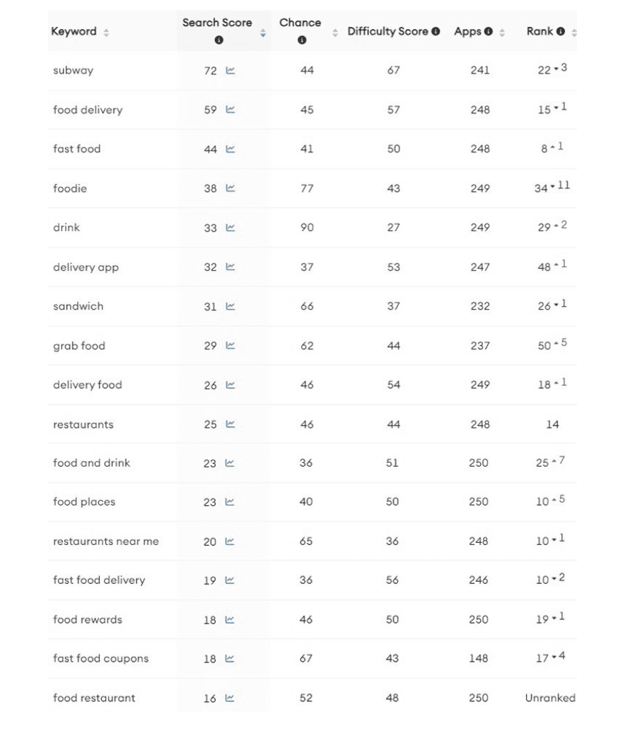
Going back to the results that we got, here’s how Chick-fil-A’s ranking looks like:
- “Drink” keyword has a search score of 33, which we rank at no. 29.
- “Food delivery” keyword has a search score of 59, which we rank at no. 15.
- “Foodie” keyword has a search score of 38, which we rank at no. 34.
- “Delivery food” keyword has a search score of 26, which we rank at no. 18.
- “Food and drink” keyword has a search score of 26, which we rank at no. 25.
- “Food rewards” keyword has a search score of 18, which we rank at no. 19.
- “Rewards” keyword has a search score of 40, which we rank at no. 34.
- “Delivery app” keyword has a search score of 32, which we rank at no. 48.
- “Sandwich” keyword has a search score of 31, which we rank at no. 26.
- “Grab food” keyword has a search score of 29, which we rank at no. 50.
We also did research on competitor keywords. We got the following results:
- “Subway” keyword has a search score of 72, which we rank at no. 22.
- “KFC” keyword has a search score of 56, which we don’t rank.
- “Sonic app” keyword has a search score of 37, which we rank at no. 38.
- “Hardees” keyword has a search score of 50, which we rank at no. 16.
- “Denny’s” keyword has a search score of 49, which we rank at no. 25.
- “Penn station” keyword has a search score of 42, which we rank at no. 19.
- “Golden Corral” keyword has a search score of 41, which we rank at no. 36.
- “Taco johns” keyword has a search score of 41, which we rank at no. 16.
- “Churchs chicken” keyword has a search score of 33, which we rank at no. 16.
- “Peter piper pizza” keyword has a search score of 37, which we rank at no. 19.
The results show us that there is a lot of work to do. To ensure that we climb up the rankings, we should use these keywords in our metadata.
Title
The title of Chick-fil-A in the App Store is this:
Chick-fil-A
Take note that the App Store allows us to use up to 30 characters for the title. As of now, Chick-fil-A is using 11 characters. In the app store, every character counts, and it should be maximized as much as possible
Looking at the search scores of the keywords included in the title, the search score of “Chick-fil-A” is 50. This keyword has a high search score. However there is excellent opportunity for improvement.
To ensure we stay competitive, we must test the title and its keywords continuously. One way to improve the title is to go to the keyword pool. From there, we should continuously check how many keywords we are ranking for that are in the title. For instance, we could check the keyword “order food” in our keyword pool.
After starting to use the “order food” keyword, do we start ranking higher for these keywords? Do we start ranking for more keywords that include “order food”? If the keywords are not improving our ranking, then we should test other keywords and their variations.
In this case, we can try a new title like:
Chick-fil-A: Delivery & Food Perks
As you can see, we have added the words “delivery”, “food”, and “perks”. This is a great move in terms of keyword ranking for the following reasons:
- The term “food” has a high search score of 58.
- The term “delivery” has a high search score of 47.
- The term “perks” has a high search score of 27.
All these changes to the title can potentially improve keyword ranking. However, please note that there are other combinations and possibilities when it comes to using keywords.
That’s the reason you need to constantly test these keywords. You should check your keyword ranking every week and see if the changes in your title bring better results.
Subtitle
The subtitle of Chick-fil-A in the App Store is this:
Order ahead. Redeem rewards.
Like the title, Apple allows us to use up to 30 characters in the subtitle. As of now, Chick-fil-A uses 28 characters.
Looking at the search scores of the keywords included in the subtitle, the search score of “order” is 28, “ahead” is 23, “redeem” is 25, and “rewards” is 40. As you can see, all keywords have high search scores, and we can conclude that Chick-fil-A has a quite strong subtitle.
Even though, if we would like to test a new variation, the subtitle can be changed to:
Order, Enjoy Rewards & Save
As you can see, we have added the words “enjoy”, “save” and excluded the words “ahead” and “redeem”. This is a great move in terms of keyword ranking for the following reasons:
- The term “save” has a high search score of 30.
To ensure we stay competitive, we must test the subtitle and its keywords continuously. One way to improve the subtitle is to go to the keyword pool. From there, we should continuously check how many keywords that are in the subtitle. For instance, we should check the keyword “restaurant” in our keyword pool.
After starting to use the “save” keyword, do we start ranking higher for these keywords? Do we start ranking for more keywords that include “save”? If the keywords are not improving our ranking, then we should test other keywords and their variations.
Ratings
Looking at the ratings, we can see a lot of things to improve here. Take note that Chick-fil-A, at the time of this writing, has an average rating of 4.9 stars from more than 2.9M users.
Let’s compare that to their competitors:
- McDonald’s – 4.8 stars from 3.2M users
- Jimmy John’s Sandwiches– 4.9 stars from 1.4M users
We do need to improve app features and overall user experience to raise the ratings up and get more positive reviews.
Screenshots
Screenshots can either make or break your app. Use the wrong screenshots and you’ll surely chase away users. Use the right screenshots and you’ll attract more users.
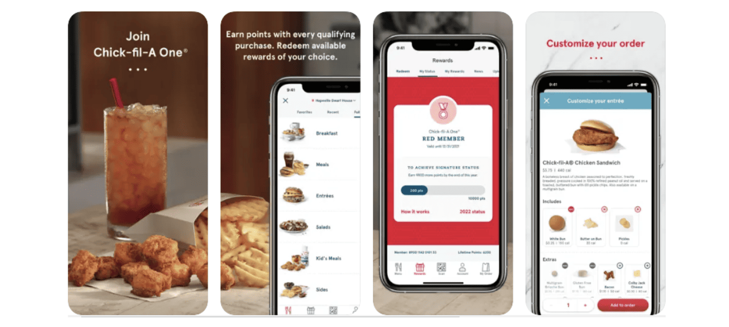
As we take a look at Chick-fil-A’s screenshots, we can see that they have chosen great images. However, Chick-fil-A can use more value-oriented headlines on the screenshots. It is super important to choose screenshots that show the value, features, and reasons why users should use your app. Here are some of our feedback for Chick-fil-A:
- Readability: The font size is adequate. Headlines make grammatical sense. However, using different font sizes & colors in images might feel confusing.
- Headline strength: The current messaging is strong. However, different messaging can be A/B tested.
- Social proof: Testimonials, media coverage, # of downloads, etc. could be showcased.
- Cover Screen & Chicken Sandwich Image: A new cover screen can be created, including Chick-fil-A’s logo along with chicken sandwich images.
- Video (App Preview): A preview video that shows food ordering through the app’s functions could be added to the first slot.
The App Store allows us to use up to 10 screenshots. However, these screenshots don’t have equal exposure. As you may already know, potential users will initially see the first three screenshots. They need to open your page to see the rest of the screenshots.
With this in mind, you need to choose the best screenshots and place them on the first three screenshot slots.
To determine which screenshots give you the best result, A/B testing and Apple’s Product Page Optimization (PPO) are always the best way to go.
Here are a few more things to consider:
- Apple indexes the title, subtitle, and keyword list to determine app rankings in the App Store.
- The app title, which can be composed of up to 30 characters, is considered to be the most important ranking factor. Thus, you should add the most crucial keyword to your title. When you do that, you’ll most likely get a higher ranking for that keyword.
- Next to the app title is the subtitle in terms of importance for indexing. Thus, other more vital keywords should be added to your subtitle. Add as many relevant and high-ranking keywords as possible to ensure you increase your ranking. Moreover, if possible, maximize the 30 character-limit for the subtitle.
- The keyword list is considered to be the number 3 most important ranking factor in the App Store. You are allowed to use a maximum of 100 characters. You need to add all the keywords that you believe are relevant to your app. You can even include brand names and competitors’ keywords. You have more flexibility to include whatever you see fit based on your keyword research. After all, users won’t be able to see this list. Only you, as the admin, can see them via the App Store Connect. But it affects your visibility significantly.
This data is pulled from Mobile Action.
Disclaimer: In this ASO Audit, we haven’t used any private data, we have purely used public data.


