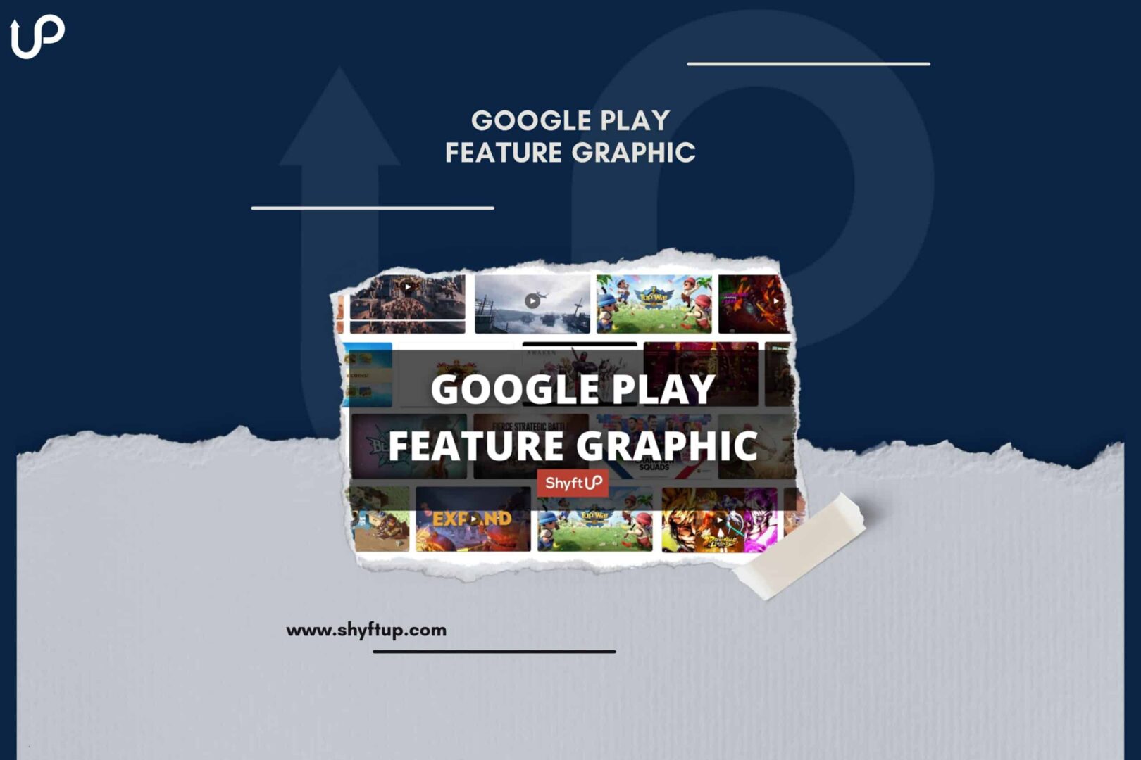
Google Play Feature Graphic

Nowadays, promoting your app in Google Play Store is exceptionally challenging. You have to go against hundreds and even thousands of mobile apps in your niche. Thankfully, there are different ways for you to gain a competitive edge over other apps, and one of them is the use of Google Play feature graphics.
Before you can take advantage of the feature graphics in Google Play, you need to understand what it is and how to use it. That’s precisely what you will learn in this post. Read on and discover the power of Google Play feature graphics.
What is Google Play Feature Graphic?
The Google Play Feature Graphic is a large banner-like image that appears on your app listing page. The feature graphic provides a significant opportunity to make a lasting first impression on your potential users.
 Here’s an example of a feature graphic.
When the feature graphic was made available in the Play Store, it was initially placed on top of your app store listing. However, the app listing page was redesigned, so now, Play Store displays feature graphics before your screenshots.
The feature graphic can be a specific image that you upload. However, if you have an app promo video, Play Store will use your YouTube thumbnail, and you will then see a play button overlaid on top of the feature graphic. Users can then tap or click on the play button to watch your app video.
According to Google, your feature graphic should meet the following technical requirements:
- JPEG or 24-bit PNG (no alpha)
- Dimensions: 1024px by 500px
Why is Google Play Feature Graphic important?
The Feature Graphic can have a direct influence on your app’s visibility, downloads, and user engagement. As you can imagine, the feature graphic is among the first things your users would see. In fact, before they can see your screenshots, the feature graphic would first appear.
With this in mind, here are some of the compelling reasons Feature graphics are essential:
- Feature graphics give users a quick overview of what your app is all about.
- Feature graphics can grab people’s attention and provide a solid first impression.
- Feature graphics encourage users to download your app by outshining competitors.
- The Play Store considers your feature graphic when determining how relevant your app is for a user’s search.
- Feature graphics help improve your brand.
- Having a feature graphic gives you a chance to get a spot in Play Store’s feature section. Without a feature graphic, Play Store won’t consider you to be part of their list of featured apps.
- The Play Store displays feature graphics in other areas of the platform. These include the “Recommended” section and the Ads section. Users also see feature graphics when doing a brand search.
As you can see, feature graphics create a marketing opportunity that could lead to higher user impressions and engagement.
What is the role of feature graphics in ASO?
App Store Optimization (ASO) is the process of improving or optimizing your app’s listing to increase visibility and rank on app stores. Since feature graphics are not required in the Play Store, you might think that they are not that important. In reality, feature graphics are super important.
Feature graphics are not just essential in helping users know what your app is all about, but they can actually improve your ASO and, therefore, increase your app ranking.
To better understand this concept, here are a few ways that feature graphics impact ASO:
Increased Click-Through Rates
High-quality feature graphics create a strong first impression for potential users. This means that people are more likely to notice your app simply because you have an impressive feature graphic.
Bear in mind that the feature graphic appears first before the screenshots. This means that feature graphics have a greater opportunity to make an impact on users, which leads them to explore your app even more.
When users see your feature graphic and it has piqued their curiosity, they will most likely click on your app. This leads to an increase in the click-through rate (CTR) of your app listing.
What you need to understand is that the Play Store takes into consideration the CTR of an app. The higher your CTR, the higher your chance of appearing on top of search results.
Differentiation from Competitors
You know the intense competition that exists in the Play Store. You need something that would differentiate you from your competitors, and feature graphics would be one of the best ways for you to do it.
As mentioned above, feature graphics are not required in the Play Store. This means that not all apps have a feature graphic.
If you have a feature graphic, then that gives you an edge over other similar apps. Potential users are more likely to be impressed by apps that have feature graphics compared to apps that don’t have one.
The increased attention you get from your users through graphic features would positively contribute to your app ranking.
Potential to get featured
The feature section of the Play Store can instantly make your app popular. It brings your app to the front and center of users’ focal attention. However, if you want to be in the feature section, you should have a feature graphic.
Overall, feature graphics play an essential part in App Store Optimization (ASO), directly impacting app visibility, user engagement, and ranking on the app store.
Therefore, it’s imperative that you should exert effort into designing an attractive and unique feature graphic. By doing so, you’ll have a feature graphic that accurately represents your app’s features and makes sure your app stands out against the competition.
How to add Google Play Feature Graphic?
To add a feature graphic, log into your Google Play Console. From there, open the dashboard and go to “Store listing.” Go to the Graphic Assets section. You should find the option to add the feature graphic just below your screenshots.
Remember, if you have a YouTube app promo video, the Play Store will use the thumbnail that you uploaded via your YouTube studio. This means that if you have a promo video and you want to change your feature graphic, you need to change your Youtube video thumbnail.
Best practices in choosing Google Play feature graphic
Google Play feature graphics can do wonders for your app marketing. However, it will only give you positive results if you use suitable feature graphics.
How can you create the right feature graphic? Here are essential tips that you should remember:
Highlight what your app offers
Your feature graphics should effectively show what your app is all about. This means you use the graphics as a means to highlight the core value of your app.
Avoid redundancy in design
Don’t include the same app icon in your feature graphics or other prominent branding elements that are already included in your app listing. If you do so, this will cause duplications.
Avoid cluttering your graphic
Remember that phone screens have limited space. Thus, don’t add details to your feature graphics that are too small that people can’t see them anymore.
To attract users quickly to your app, the Feature Graphic must be visually appealing and easily comprehended by viewers. Avoid cluttering it with too many elements or text – this will only impede users from understanding its purpose quickly.
Place key details on the center
Put the essential details of your feature graphics at the center of your image. Aside from that, remember that there are cutoff zones in the feature graphic. Some phones might not be able to display all parts of your image. Here’s what the focal point and cutoff zones look like:
 Place key elements in the central focal point of your graphic.
 Don’t place your key elements in the red cut-off zone.
Choose the right colors
Use vibrant colors in your feature graphic. These colors could make your graphic pop out or stand out from other graphics on the Play Store or in your app listing.
Aside from that, avoid using dark gray and pure white colors, which are the primary colors in the Play Store. This will make your feature graphic blend with background colors, making it more difficult to see.
Moreover, choose colors that would complement the other colors in your app listing. Aside from making your app listing page more aesthetically attractive, people can easily associate your graphic with your brand and app.
Localize your feature graphic
If your app is available in other languages, be sure to localize your graphic, text, and other elements to reflect the culture, norms, and language of your chosen market.
Avoid certain words
Don’t include promotional information and details that have to do with ranking, awards, accolades, and testimonials. According to Google, don’t include words such as “top,” “Best,” “New,” “Free,” “Sale,” “Discount,” “Million Downloads,” and other related words.
Use evergreen elements
You should not include time-sensitive content. For example, if you include in your feature graphics things about Thanksgiving, it will soon not be relevant anymore once the holiday is over.
Use your own graphics
Don’t use logos and trademarked characters that you are not allowed to use or you don’t have permission to do so. Aside from that, don’t use the icon or badge of Google Play in your feature graphics.
Apply brand consistency
Your feature graphic should reflect the branding of your app, such as its color scheme or design elements, so users are easily able to recognize it among the competition. Doing this will allow them to identify it more easily.
Use high-quality images
Ensure the images used in your Feature Graphic are of high quality and resolution. Pixelated or blurry pictures could create an unfavorable impression about your app and discourage potential users from downloading it.
Use readable text
If your Feature Graphic incorporates text, make sure that it can easily be read on smaller screens by choosing a legible font and font size.
Keep aspect ratio in mind
For optimal results when designing or selecting Feature Graphics, keep 16:9 as its aspect ratio in mind so it will look great across devices and screen sizes.
Compare different options
Explore multiple versions of your Feature Graphic and test each to determine the one with the highest downloads and greatest resonance with target audiences. A/B testing can help reveal this.
By following these best practices, you can select a feature graphic that accurately portrays your app and attracts potential users.
Google Play Feature Graphic Examples
Now that you know what it takes to create and choose the best feature graphic, it’s time to give you some inspiration. Check out the following Google Play Feature graphic examples:
Rise of Kingdom
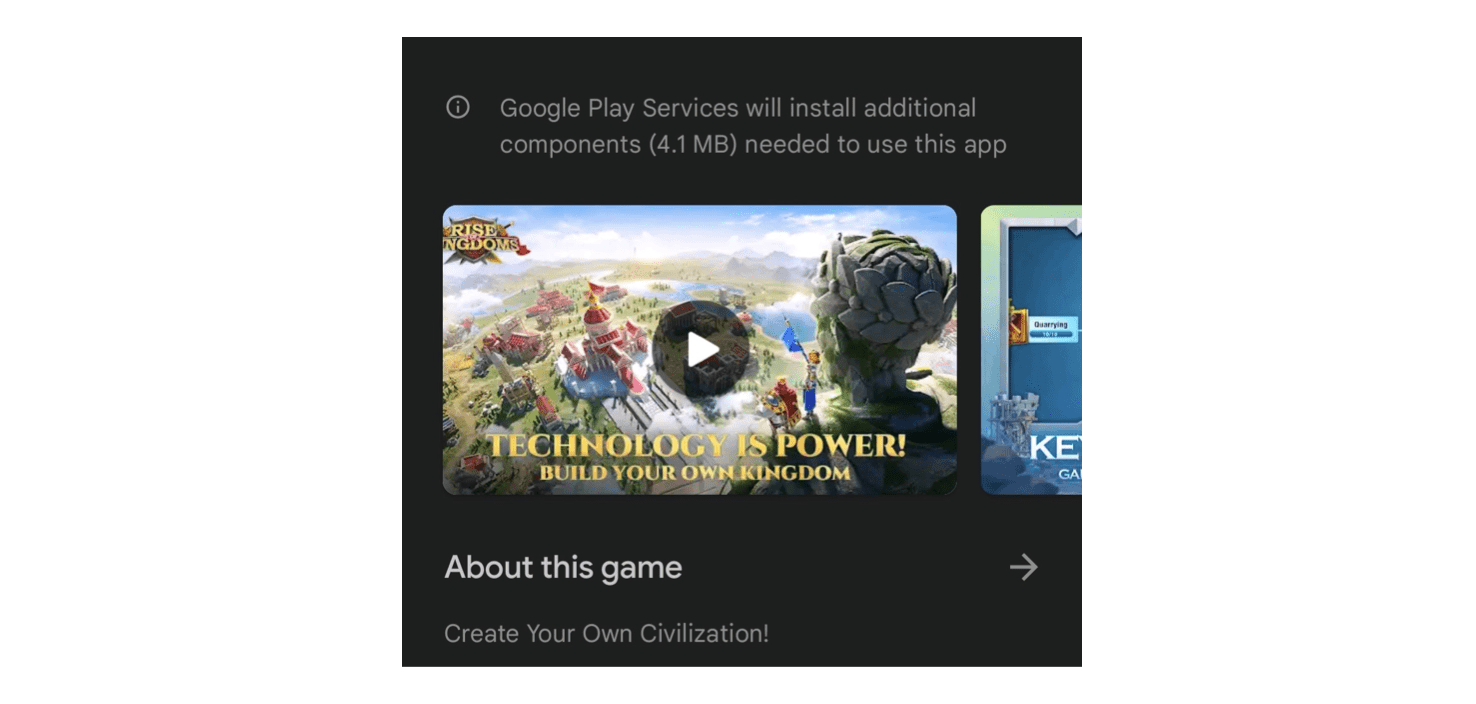
The best thing about this feature graphic is the quality of the image. It is something that is well thought of. It has all the necessary elements to make the image look professional, appealing, and, most importantly, inviting. It definitely makes anyone want to click on that play button.
Design Home
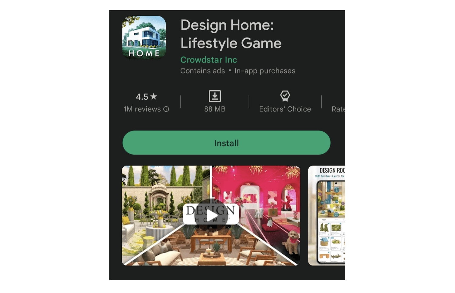
Design Home’s feature graphic is just amazing. With one look, you’ll see what the game is all about. It has images for the outdoors and indoors. This gives anyone a quick understanding of what the app is all about.
LightX
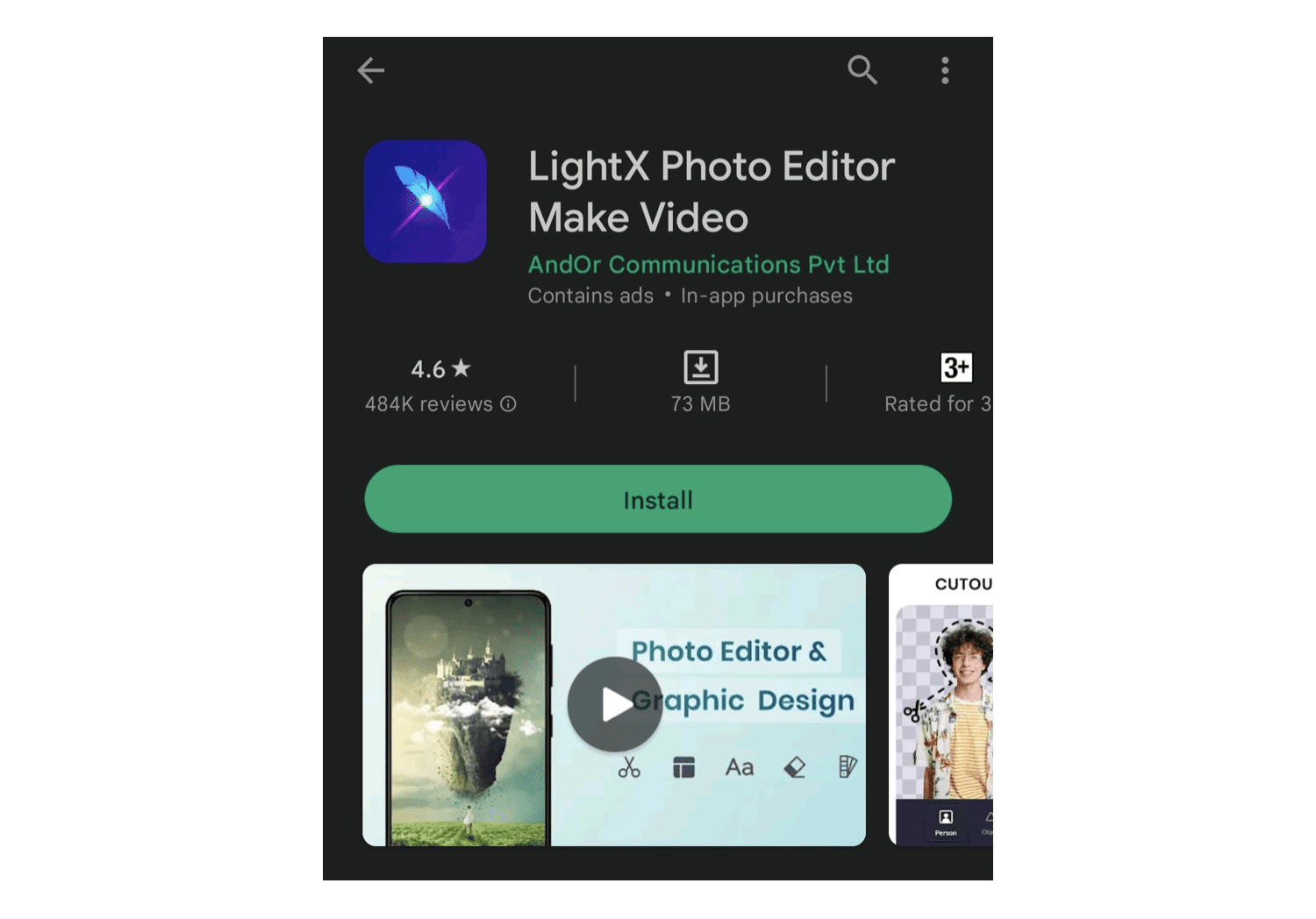
Minimalistic, intriguing, and detailed — these are just some of the words that describe the feature graphic of LightX. As a photo editor, it catches people’s attention plus quickly provides what tools are available in the app.
Remini
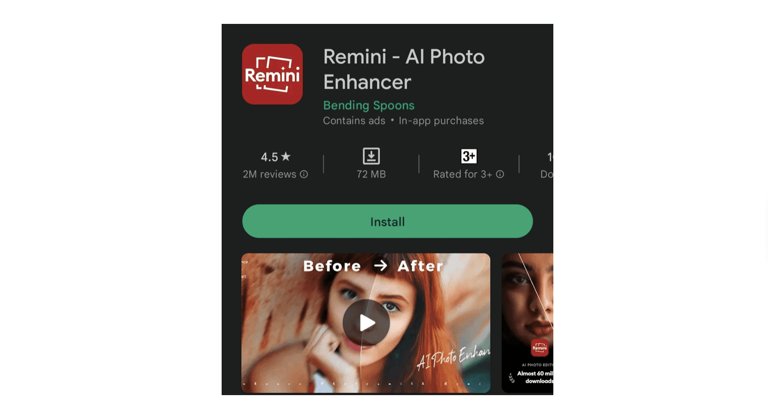
Remini is a photo editor that enhances images. So, naturally, users would like to know the results it can provide. In its feature graphic, it shows you a before and after comparison of an image. It’s an excellent strategy for any photo editing app to help users understand how their app can improve their images.
Chess.com
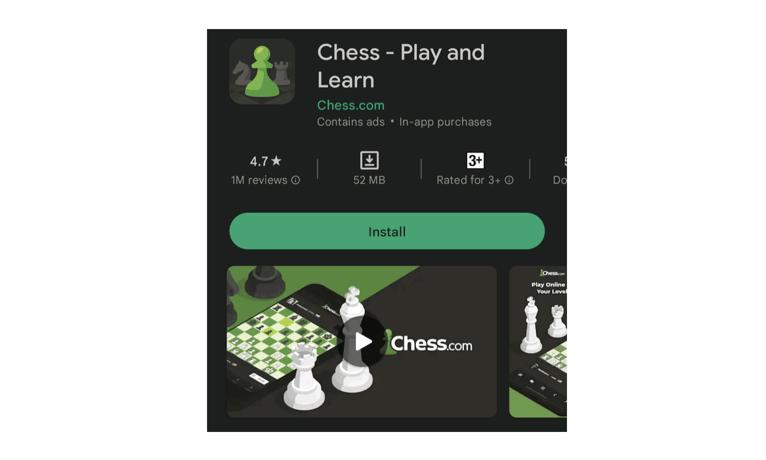
Again, a simple design is easy to make, but it definitely works. As an app about chess, you want to exude an air of elegance, brilliance, and fun in your app. In the feature graphic of Chess, you’ll see the design to be easy for the eyes. It doesn’t overcomplicate what the game looks like.
Have the suitable Google Play Feature Graphic
The Google Play feature graphic is an effective way to improve the visibility of your app, get more attention from your users, and better explain what your app is all about. However, creating and choosing the right graphic can be a little more challenging if you don’t exactly know how to do it.
Thankfully, ShyftUp is here for you. As one of the best user acquisition agencies today, they can help you create the best feature graphic for you. They can help you test various versions to see which one would give you your desired results.
Moreover, ShyftUp has the necessary knowledge, expertise, and tools to perform ASO campaigns and increase your app’s discoverability in app stores.
Give them a try today and see how they can dramatically improve your app’s success!
What are the recommended dimensions for a Google Play Feature Graphic?
The recommended dimension for a feature graphic on Google Play Store is 1024px by 500px.
What are common mistakes to avoid when designing a feature graphic?
There are different mistakes that you should avoid. These include misrepresenting your app, too much text, overcrowding the graphic, lack of creativity, poor image quality, and not following the guidelines of the Play Store.
How do I make Google Play feature graphics?
There are several ways for you to make feature graphics. You can use a graphic design tool such as Photoshop or Canva. Aside from that, you can hire a professional designer who can create high-quality graphics for you.
What is Google Play Feature Graphic?
Why is Google Play Feature Graphic important?
What is the role of feature graphics in ASO?
Differentiation from Competitors
How to add Google Play Feature Graphic?
Best practices in choosing Google Play feature graphic
Highlight what your app offers
Place key details on the center
Subscribe to our Newsletter
