Source Creative Design Best Practices for Apple Search Ads Success
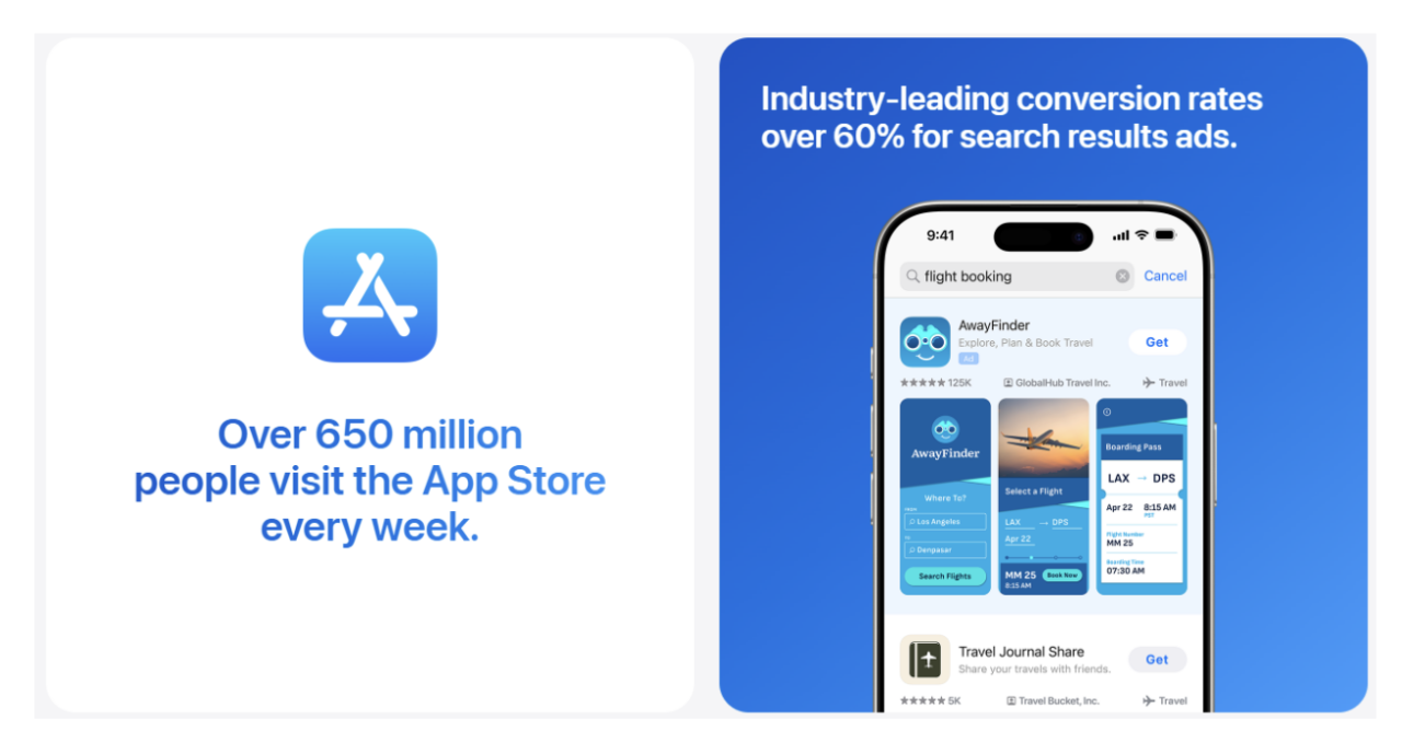
The Apple App Store is massive. With over 1,929,904 apps and more than 794,730 app publishers competing for attention, standing out isn’t just hard — it’s a strategic challenge.
If you’re an app developer or mobile marketer trying to break through all that noise, simply building a great app isn’t enough. You need visibility. And one of the most effective ways to get that visibility is through Apple Search Ads — a powerful tool that places your app in front of high-intent users right when they’re searching.
But here’s the catch: targeting the right keywords only gets you halfway. If your ad creatives don’t spark interest, your campaign will fall flat, no matter how good your keyword strategy is.
That’s where creative design makes all the difference.
In this guide, we’re diving deep into the creative design best practices for Apple Search Ads success. Whether you’re a seasoned mobile marketer, an indie app developer, or even just someone curious about how app store advertising works, this post will break it all down in a way that’s clear, practical, and actionable.
Let’s get into it.
First, let’s answer the big question:
What role does creative design play in Apple Search Ads?
In short, it plays a huge one.
When someone searches for an app on the App Store, your ad appears in a split second. That moment is your shot. Users decide in an instant whether to tap or scroll past. And what do they base that on?
Your ad creative.
That means:
- The screenshots they see
- The app preview that plays
- The text that catches their eye
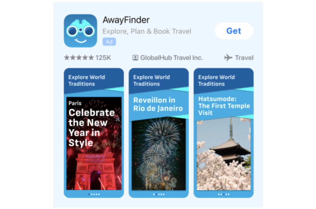
Apple Search Ads are not just text-based ads. They’re rich, visual experiences built on the assets from your App Store product page, so what you put there matters.
Where does the creative come from?
Apple gives you two options when choosing ad creatives:
- Default – Uses assets (screenshots, preview videos, icons) from your default App Store product page.
- Custom – Uses assets from a custom product page you build in App Store Connect.
When a user taps your ad, they’re taken directly to the product page from which your creative was built. That means alignment between your ad and your landing page is baked in — if you do it right.
So if you want to create effective and high-performing Apple Search Ads, you’ve got to pay close attention to your App Store product pages — both default and custom.
Designing attention-grabbing ad creatives
Let’s get practical.
No matter how great your targeting is, your Apple Search Ads won’t convert if your creatives don’t stop the scroll. Creative design isn’t just decoration — it’s a decision-making tool that guides users to tap your app over someone else’s.
Below are proven Apple Search Ads creative tips that help you cut through the clutter and drive meaningful results:
1. Start with strong visuals
Think of your first screenshot or app preview as your handshake. It’s your first impression — and in the App Store, first impressions can make or break your ad.
Here’s how to make that first visual count:
- Show your app’s biggest value upfront. Lead with the most exciting, useful, or unique feature.
- Keep it clean and focused. Avoid cluttered images. Simplicity wins on a small screen.
- Use high contrast and bold colors. Your ad needs to stand out in a sea of competing visuals. Don’t be afraid to go bold — just stay on-brand.
A strong visual doesn’t just look good. It sells your app.
2. Tell a story through your screenshots
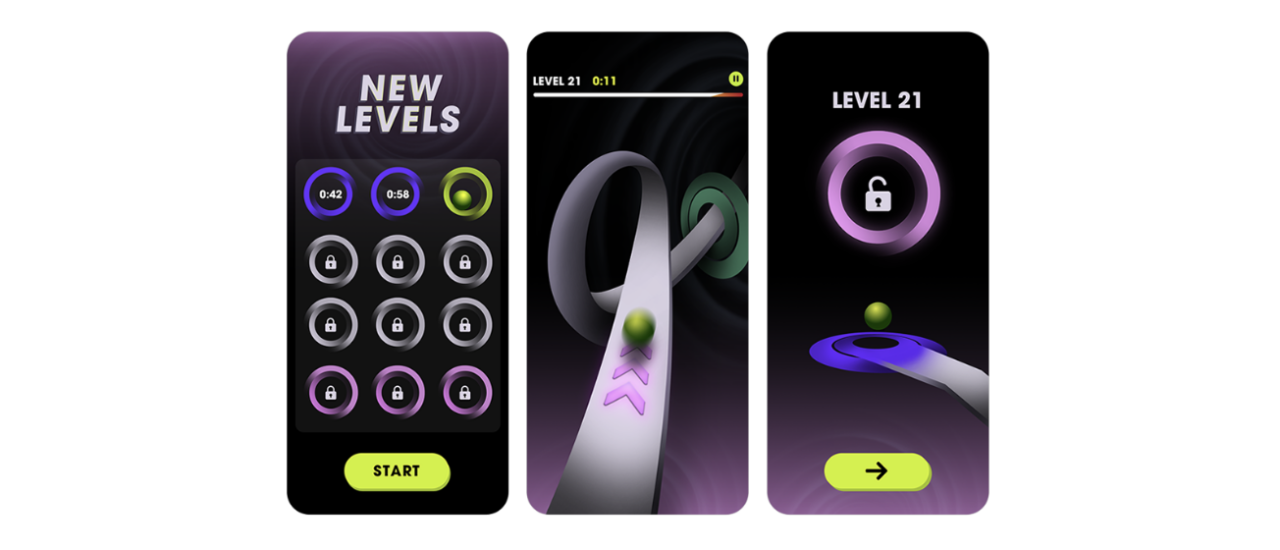
Screenshots are more than pretty pictures — they’re a mini-tour of your app. Don’t just upload random screens. Be intentional. Be strategic.
Think like a storyteller:
- Sequence your screenshots to guide the user. Each screen should naturally lead to the next.
- Create a visual flow. Walk users through key actions: onboarding, using features, and getting results.
- Call out benefits, not just features. For example:
- Instead of “Dashboard view,” say “Track workouts instantly.”
- Instead of “Settings screen,” say “Customize your routine with one tap.”
Make your screenshots answer the user’s #1 question: What’s in it for me?
3. Prioritize readability
You only have a few seconds to communicate your message — don’t waste them with hard-to-read text.
Here’s what works:
- Use large, clear fonts. Think legibility, not style. The best text overlays are readable at a glance.
- Keep it short and punchy. Use 3–5 words max per frame.
- Contrast is key. Make sure your text pops against the background. If it blends in, it’s invisible.
Avoid tiny, fancy, or overly stylized fonts — they may look nice in full size, but most users won’t be zooming in.
4. Use App Previews wisely
If a picture’s worth a thousand words, then a short video is priceless.
App previews can boost engagement if they’re done right. But remember: users scroll fast, and most watch silently.
Here’s how to get the most from app previews:
- Keep it short. Aim for 15–30 seconds — enough to show value without losing attention.
- Focus on one core feature. Don’t cram everything in. One clear message per video.
- Use motion to your advantage. App previews autoplay silently, so let visuals do the talking. Use gestures, transitions, and animations to guide the viewer.
- Show the actual in-app experience. Avoid overproduced effects. Users want to see what it’s actually like to use your app.
And don’t forget — your preview should be vertical (portrait orientation) to match the browsing experience on iOS devices.
Bonus tips for higher impact
- Stay on-brand: Your ads should look like an extension of your app. Keep your color scheme, typography, and tone consistent.
- Localize creatives for different markets: If you’re targeting different countries or languages, adjust your visuals and messaging accordingly.
- Test, then tweak: What works for one audience might not work for another. A/B test your creatives regularly to see what resonates best.
Creating effective ad creatives takes more than good design — it takes intentional, user-focused thinking. You’re not just trying to make your ad look good. You’re trying to make someone stop, look, and tap now.
That’s the power of smart creative design for search ads. And when done right, it can be the difference between being seen… and being overlooked.
Next, let’s explore how creative testing helps you double down on what actually works.
Custom product pages: the game-changer
If you want to level up your creative design for search ads, custom product pages are your secret weapon. With up to 35 custom product pages, you can:
- Tailor creatives for different keyword themes
- Showcase specific app features
- Add deep links to specific app sections
- Align creatives with seasonal promotions
And the best part? You can build and manage them in App Store Connect without submitting a new app version. All you need is Marketing role access.
Let’s say you’re promoting a travel app. For keywords like “travel dining” or “vacation restaurants,” you can:
- Create a custom product page that shows your dining features
- Use screenshots of restaurant recommendations, booking interfaces, or reviews
- Add a deep link to take users straight to the dining section in-app
That’s relevant. That’s effective. That’s Apple Search Ads done right.
How to create ad variations that convert
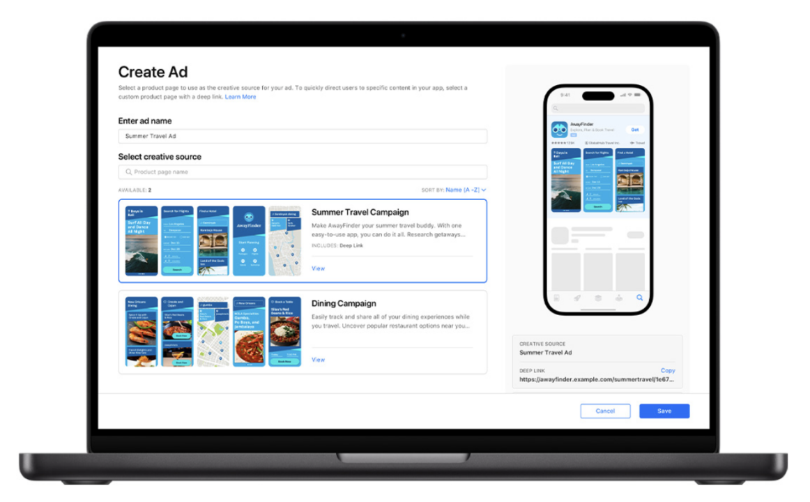
Apple allows you to create ad variations for your campaigns using your custom product pages. This gives you flexibility and precision.
Here’s how to create an ad variation:
- Go to the Ad Groups dashboard
- Click the ad group you want to modify
- Select Create Ad
- Name your variation (e.g., “Summer Travel Ad”)
- Choose a custom product page
- Preview your ad
- Save and activate it
Note: You can only have one active custom ad per ad group at a time. If you’re testing, you’ll need to choose which one to pause or run.
Creative Testing: Why It Matters
How does creative testing impact campaign success?
The answer: massively.
Not all visuals perform equally. That’s why you need to test variations. Try different:
- Screenshots
- App previews
- Messaging styles
- Deep link destinations
Measure performance over time. Optimize what works. Replace what doesn’t. This iterative approach will boost your tap-through rate, lower your cost-per-tap, and ultimately, increase installs.
Creative testing isn’t just a good idea — it’s a best practice for ad design.
Best practices for ad design (that actually work)
Here’s a quick-hit list of best practices for ad design that consistently drive results:
- Align visuals with keyword intent
What people search for = what they want to see.
Don’t guess. Customize creatives to match the keyword themes of each ad group.
- Show, don’t tell
Demonstrate value. Let visuals do the talking. Users should “feel” what using your app is like just by looking.
- Use deep links
Help users land where they want to go. Direct them to the most relevant in-app experience to reduce friction and increase conversions.
- Keep your assets fresh
Update screenshots and promotional copy regularly. Highlight new features, seasonal offers, or trending content.
- Think global, act local
If you’re running international campaigns, make sure your creatives are compatible with regional settings (language, devices, formats).
Tap Into the Power of Moments
Seasonality can be a superpower.
Create ad variations for:
- Back-to-school
- Holidays
- New Year resolutions
- Summer vacations
- Major app updates or launches
Want to promote a fitness app in January? Use a variation showing people exercising with “New Year, New You” messaging.
These moment-specific creatives speak to people’s current mindset — and convert better.
The secret to scale: creative alignment across channels
Your custom product page includes a unique URL. That means you can use it across:
- Social media ads
- Email campaigns
- Influencer promotions
- Website banners
- Even offline campaigns like QR codes
This creates consistency across your marketing funnel and reinforces your brand message. Users land on a page that looks exactly like the ad that brought them there.
Consistency builds trust. Trust leads to downloads.
Conclusion: want creative ads that drive real results?
You now understand why creative design is not just a nice-to-have for Apple Search Ads — it’s the difference between average and extraordinary.
From tailoring your assets to keyword intent, leveraging custom product pages, to testing what works — success lives in the details.
But here’s the thing…
You don’t have to do this alone.
At ShyftUp, we live and breathe mobile marketing. Our team helps app creators just like you build high-converting, beautifully designed Apple Search Ads campaigns — from creative strategy to execution.
We know what it takes to stand out in a crowded App Store.
If you’re serious about boosting your app’s visibility, increasing downloads, and getting the best ROI on your ad spend — let ShyftUp be your partner.
Contact ShyftUp today and let’s build your best campaign yet.
Where does the creative come from?
Designing attention-grabbing ad creatives
2. Tell a story through your screenshots
Custom product pages: the game-changer
How to create ad variations that convert
Creative Testing: Why It Matters
Best practices for ad design (that actually work)
